

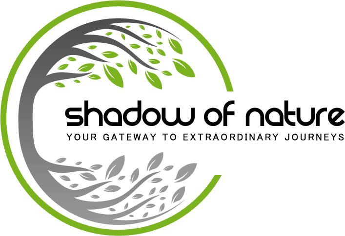
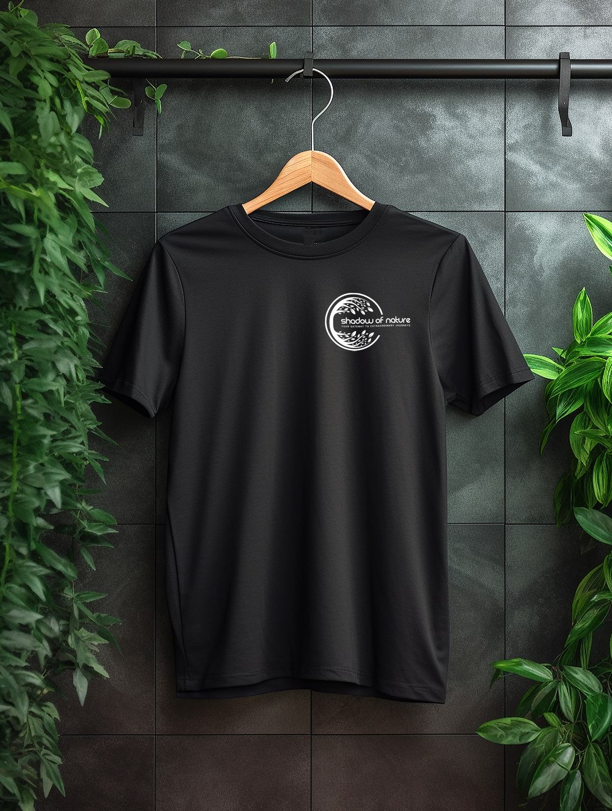
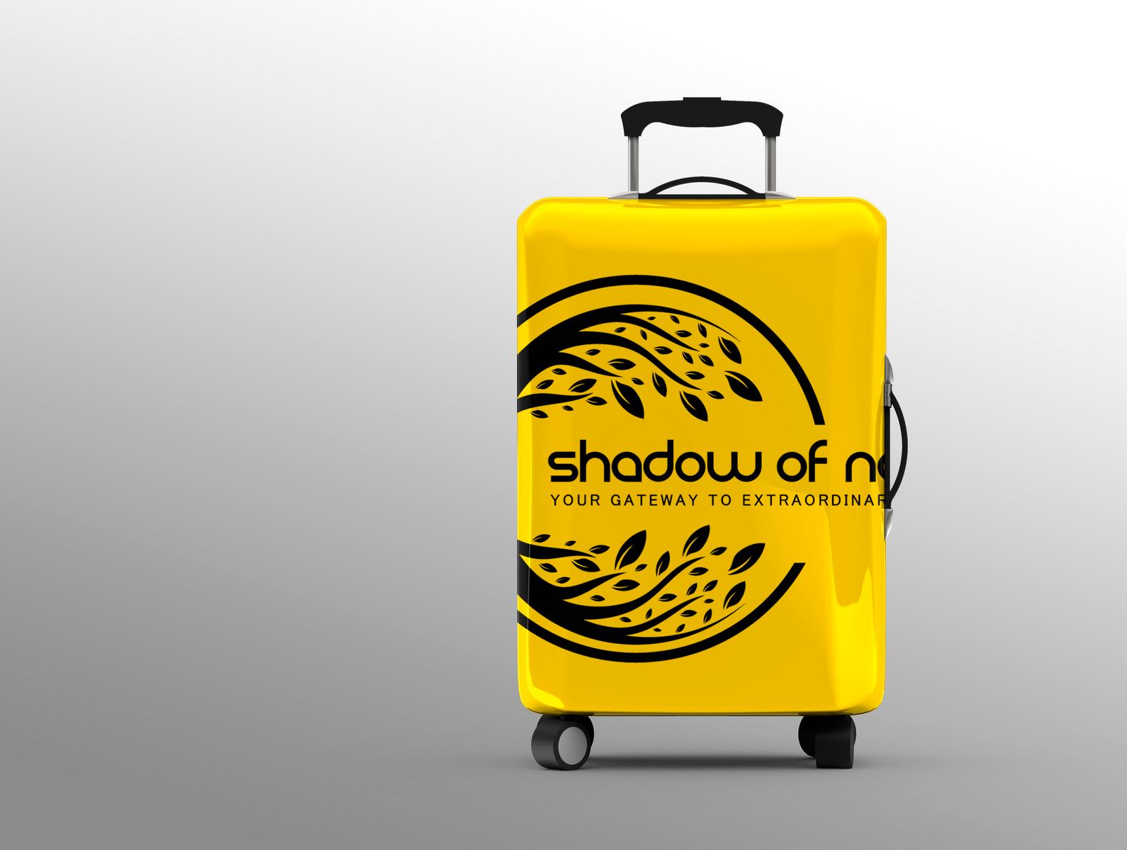
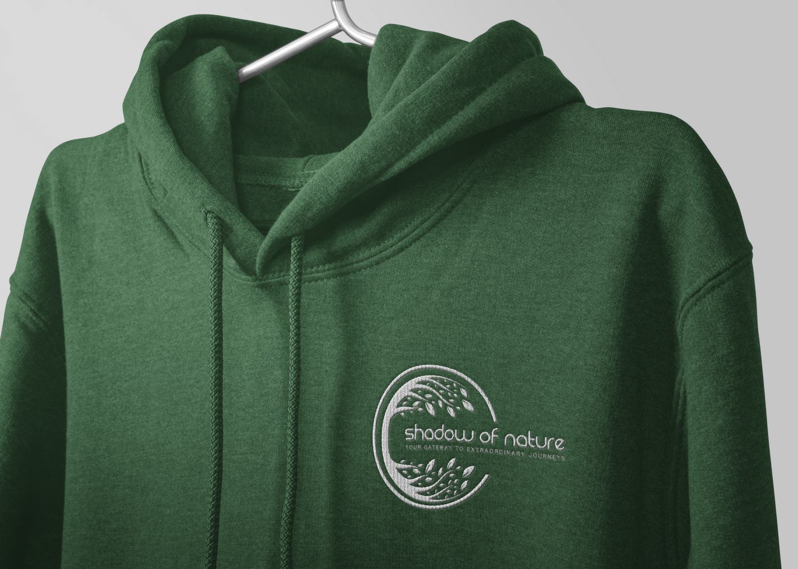
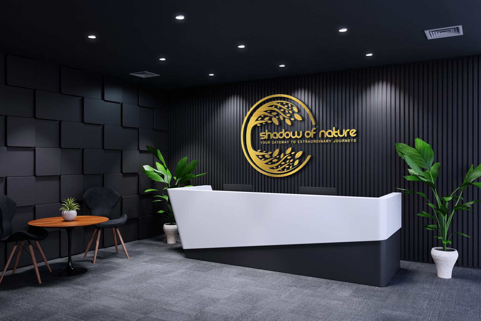
The logo for “Shadow of Nature” prominently features the “Shadow of Nature” lettering in the Tazugane Gothic Regular font. Tazugane Gothic Regular is a sleek and modern sans-serif font known for its simplicity and legibility, making it an ideal choice for conveying a clean and contemporary aesthetic.
The utilization of the Tazugane Gothic Regular font, exclusively selected for “Shadow of Nature” by our branding experts, imparts a distinct and refined character to the logo. Typography is a pivotal element in visual branding, and the deliberate selection of this font communicates a modern and sophisticated visual identity for our travel company.
This choice of font reflects our commitment to presenting “Shadow of Nature” as a brand that seamlessly combines elegance with modernity, capturing the essence of transformative travel experiences.
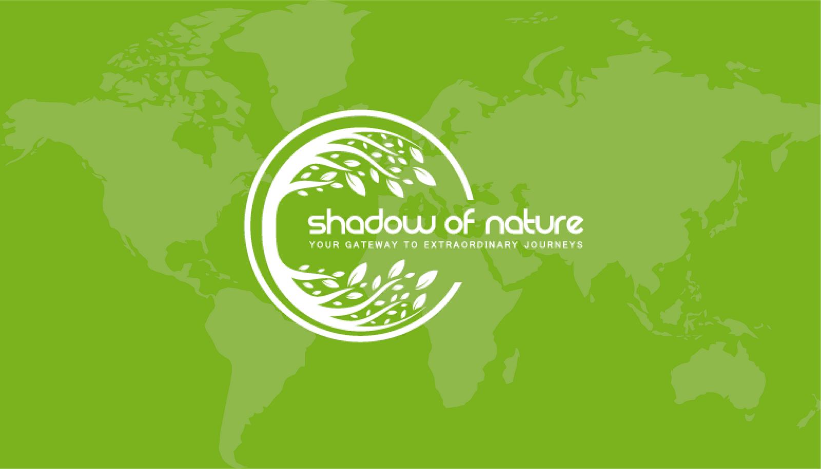
The primary color palette for “Shadow of Nature” is carefully curated to evoke a harmonious blend of nature’s hues. The hexadecimal codes for these colors are as follows:
Moss Green (#90b030): This shade symbolizes the lush and vibrant landscapes found in nature, conveying a sense of tranquility and vitality.
Charcoal Gray (#535353): This deep gray adds a touch of sophistication and complements the natural greens, creating a balanced and modern aesthetic.
Silver Gray (#8b8b8b): A subtle and versatile gray, representing the timeless and enduring qualities of nature.
Jet Black (#000): A bold and classic black that provides a strong foundation, emphasizing the brand’s elegance and depth.
This color palette for “Shadow of Nature” aims to reflect the diverse and immersive experiences offered by the travel company. The combination of greens, grays, and black suggests a connection to the earth, embodying the essence of exploration and adventure. The overall palette conveys a modern, sophisticated, and nature-inspired visual identity for Shadow of Nature.
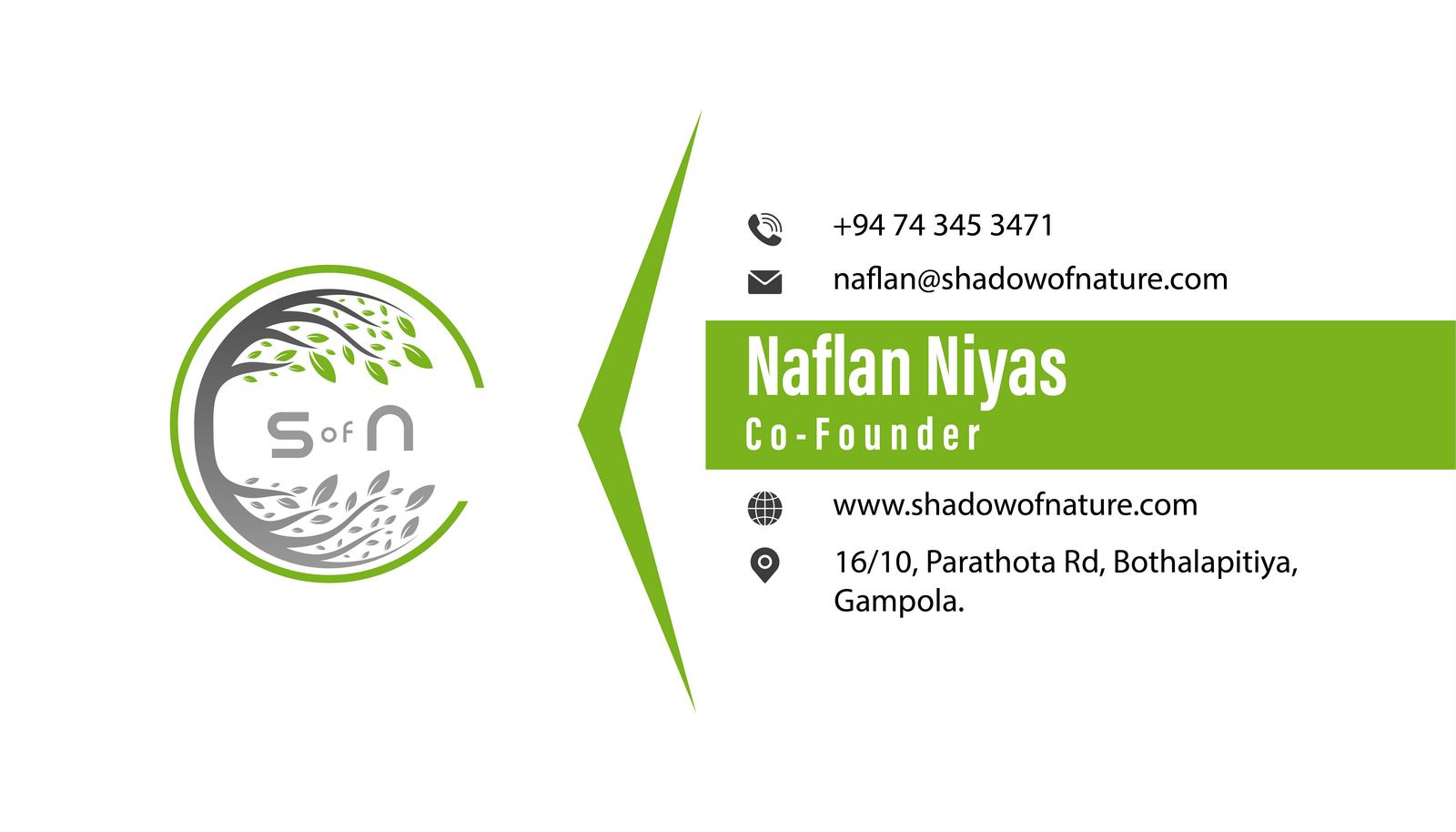
The business card for “Shadow of Nature” is thoughtfully designed to encapsulate the essence of the travel brand while providing essential contact information. Here’s a detailed description:
Front Side:
Back Side:
Design Principles:
This business card for “Shadow of Nature” serves as a visually compelling representation of the brand, inviting individuals to embark on a journey of exploration and connection with nature.
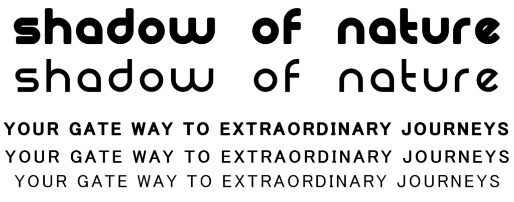
For Shadow of Nature, the font selection for the brand was meticulously curated to encapsulate its essence of natural beauty, exploration, and serenity. The primary font used, RES, embodies a timeless and organic feel, aligning perfectly with the brand’s commitment to immersive travel experiences. Its flowing lines and balanced letterforms evoke a sense of tranquility and convey the brand’s dedication to showcasing the beauty of nature.
The secondary font, RES, complements the primary font, adding versatility and enhancing the overall visual identity. Together, these fonts create a harmonious typographic system that reflects the essence of Shadow of Nature, inviting individuals to embark on a journey of discovery and connection with the world’s wonders.
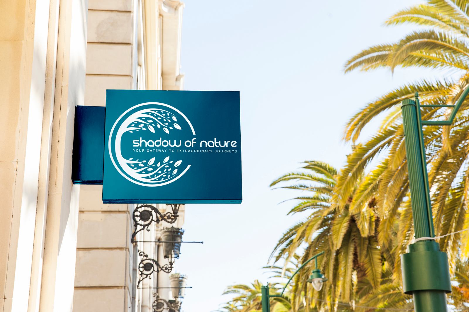
Logo Placement: The banner prominently features the captivating “Shadow of Nature” logo at the top, creating a focal point for immediate brand recognition. The logo reflects the brand’s essence and commitment to transformative travel experiences.
Color Palette: The banner incorporates the primary colors of Shadow of Nature, including Moss Green (#90b030), Charcoal Gray (#535353), Silver Gray (#8b8b8b), and Jet Black (#000). This palette harmoniously represents nature’s hues and creates a visually appealing and calming backdrop.
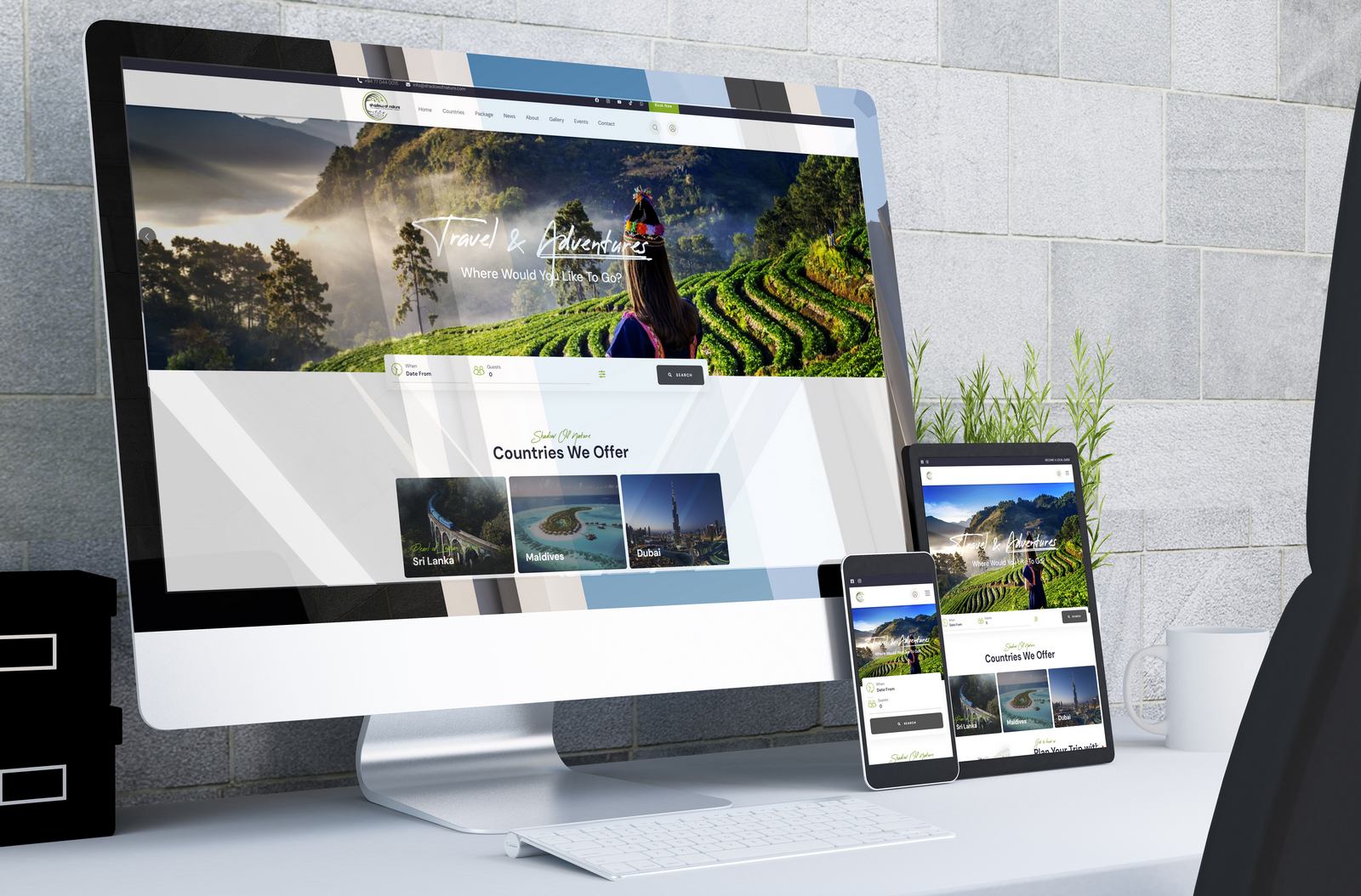
Imagery: High-quality visuals of diverse travel destinations, natural landscapes, and immersive experiences are strategically placed to evoke the spirit of exploration and connection with nature. These images resonate with the brand’s commitment to transformative journeys.
Tagline: A succinct and evocative tagline, such as “Discover the Unseen,” is displayed prominently, encapsulating the brand’s promise of uncovering hidden gems in travel experiences.
Contact Information: Essential contact details, including a business phone number, email address, and website URL, are presented at the bottom of the banner. This encourages individuals intrigued by the banner to easily connect with Shadow of Nature.
Layout: The layout of the banner is designed for optimal visibility, ensuring that key elements are easily discernible from a distance. The overall design is immersive and inviting, captivating the attention of passersby and inviting them to embark on a journey of discovery.
Size and Placement: Given its large size, the banner is ideally suited for street-level placement on a prominent wall or storefront. Positioned at eye level, it captivates the attention of pedestrians and motorists, maximizing visibility and exposure.
Branding Impact: This street-level large banner for Shadow of Nature serves as a captivating visual invitation, conveying the brand’s commitment to immersive travel experiences and encouraging individuals to embark on a journey of exploration and connection with the beauty of nature.