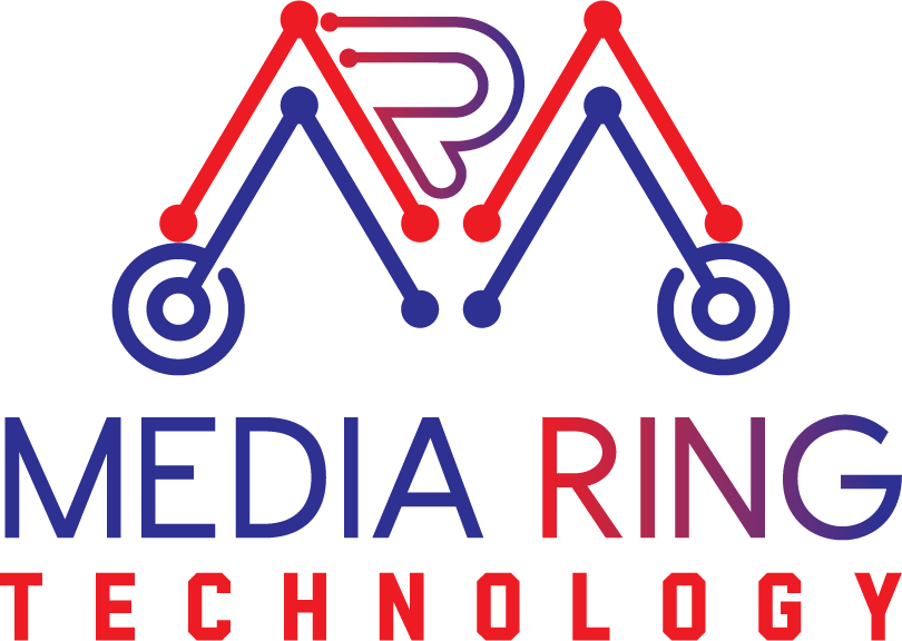
The logo designed by Home to Globe for Mediaring Technology reflects the brand’s commitment to professionalism, reliability, and cutting-edge technology solutions. Here’s a description of the logo design.
The logo features a bold and modern wordmark that combines the fonts Become and Radley Sans. The choice of typography conveys a sense of professionalism, while the clean lines and legible letterforms ensure clear communication of the brand name.
Primary Color
Secondary Color
The primary colors used in the logo design are #ED1C24 and #2E3192. The vibrant red (#ED1C24) symbolizes energy, urgency, and the brand’s dedication to providing efficient technology services. The deep blue (#2E3192) represents trust, reliability, and the brand’s expertise in cutting-edge solutions.
The secondary colors used are #0C1735 and #538DC5. The dark navy blue (#0C1735) adds depth and sophistication to the overall color palette, while the light blue (#538DC5) brings a refreshing touch and visual interest to the design.
The logo design portrays a sleek and minimalist style, ensuring versatility across different applications. It is suitable for digital platforms, print materials, and signage, allowing the brand to maintain a consistent and recognizable identity.
The logo created by Home to Globe for Mediaring Technology serves as a visual representation of the brand’s expertise, professionalism, and commitment to delivering reliable technology solutions. It captures the essence of the brand’s core values and creates a strong visual impact.
Business Card
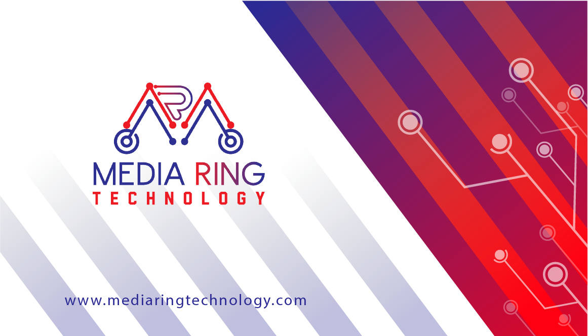
The front side of the business card for Mediaring Technology features a clean and professional design that showcases the brand’s logo prominently. The logo, designed by Home to Globe, represents the brand’s commitment to technology solutions and features a sleek and modern wordmark. The front side may also include the primary colors of #ED1C24 and #2E3192, reflecting the brand’s vibrant and trustworthy image. The card may have a minimalist layout with essential contact information, such as the company name, individual’s name, job title, and contact details.
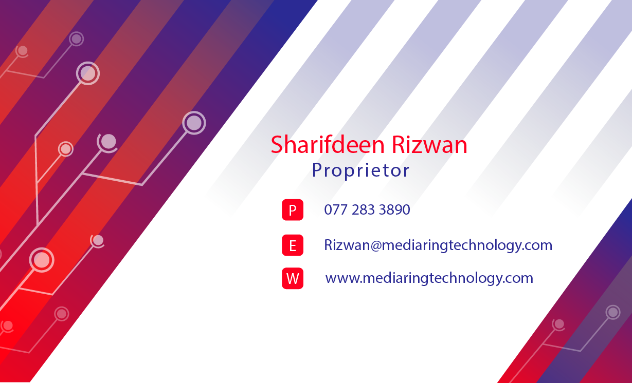
The back side of the business card provides additional information about Mediaring Technology’s services. It can include a list of the services offered, such as laptop display/battery/hard disk replacements, laptop chip-level board repair, mobile phone chip-level repair, operating system installations, data recovery, and printing and photocopy services. The card may also mention the brand’s expertise in Android and Apple devices and its proficiency in Windows installations and data recovery. The back side can have a visually appealing design that complements the brand’s color palette, utilizing the secondary colors of #0C1735 and #538DC5 to create visual interest and a cohesive brand identity.
The design of the business card is sleek and modern, reflecting the professionalism and expertise of Mediaring Technology. It incorporates the brand’s primary and secondary colors to maintain consistency with the overall visual identity. The fonts used are Become and Radley Sans, chosen to ensure legibility and convey a sense of contemporary sophistication. The layout is clean and organized, allowing for easy reading of contact information and service details.
Overall, the business card design for Mediaring Technology serves as a powerful marketing tool, presenting a professional image and conveying the range of services offered. It creates a lasting impression on clients and potential customers, showcasing the brand’s expertise in technology solutions and commitment to exceptional customer service.
Font Used

In the branding of Mediaring Technology, the typography selection plays a crucial role in conveying the brand’s identity and values. The choice of fonts, Become Regular and Radley Sans, contributes to creating a distinct and professional visual language. Here’s a description of the typography selection as a brand:
Become Regular:
Become Regular is a modern and versatile font that exudes professionalism and clarity. With its clean lines and balanced proportions, it adds a touch of contemporary sophistication to the brand identity of Mediaring Technology. The font’s readability ensures that essential information, such as the company name and contact details, is easily legible on various brand materials, including business cards, brochures, and digital platforms.
Radley Sans:
Radley Sans complements the Become Regular font by providing a sense of elegance and flexibility to the brand’s typography. This sans-serif font combines clean and geometric letterforms with subtle humanist touches, striking a balance between modernity and approachability. Radley Sans is used for the secondary text elements on the brand materials, such as service descriptions, additional contact information, and any supporting text. Its legibility and simplicity make it an excellent choice for conveying information clearly and effectively.
The combination of Become Regular and Radley Sans ensures visual consistency and a cohesive brand identity across all touchpoints. The fonts, chosen thoughtfully by Home to Globe, reflect Mediaring Technology’s commitment to professionalism, reliability, and a modern approach to technology solutions.
The typography selection for Mediaring Technology creates a harmonious visual experience that aligns with the brand’s values and personality. The fonts convey a sense of trustworthiness, expertise, and a forward-thinking approach to technology. Whether in digital or print materials, the typography selection ensures that Mediaring Technology’s message is communicated effectively and leaves a lasting impression on clients and stakeholders.
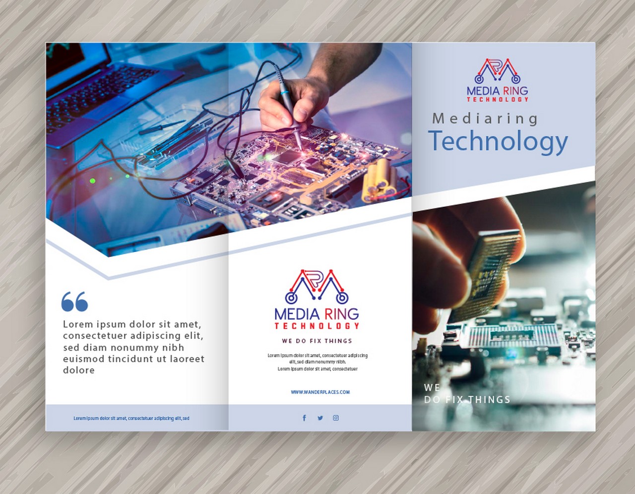
Fully Responsive Web Application

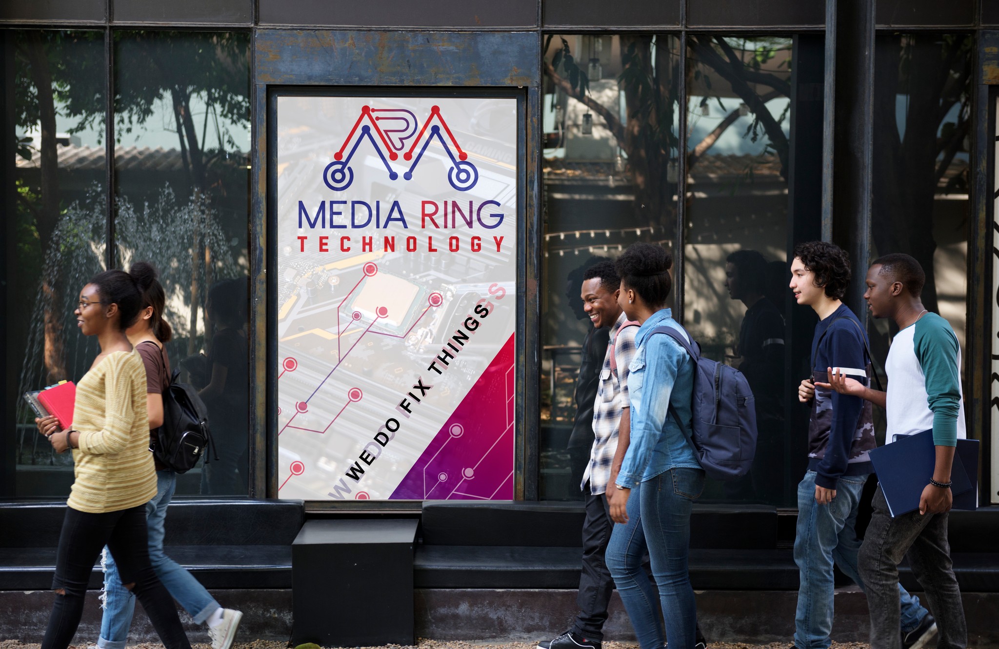
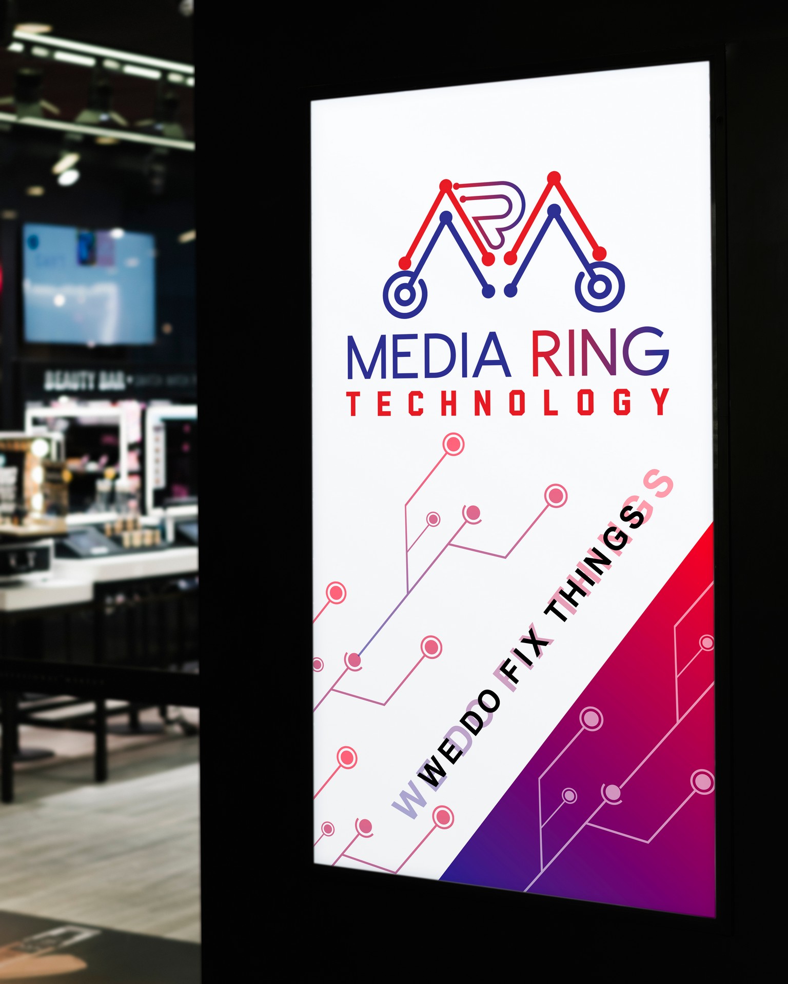
Banner Design for Mediaring Technology
Layout and Composition:
The banner design incorporates a clean and well-structured layout that captures attention and delivers the intended message effectively. The design may feature a combination of text and visuals, strategically placed to create a visually appealing and balanced composition. The layout ensures that key information is easily readable and stands out.
Brand Visuals:
The banner design incorporates visuals that represent the technology industry and align with the brand’s identity. These visuals may include images or illustrations of laptops, mobile devices, computer chips, or other technology-related elements. The visuals reinforce Mediaring Technology’s expertise in the field and add visual interest to the banner.
Color Scheme:
The color scheme for the banner design aligns with Mediaring Technology’s brand colors. The primary colors of #ED1C24 and #2E3192 are used prominently to create visual impact and establish brand recognition. These colors reflect the brand’s energy, urgency, and trustworthiness. Secondary colors, such as #0C1735 and #538DC5, may also be incorporated to add depth and variety to the design.
Typography:
The banner design utilizes the chosen typography, which includes the Become Regular font for important headlines or key messages and the Radley Sans font for supporting text. The typography ensures clarity and legibility, making the banner easily readable from a distance. The fonts convey professionalism and a modern aesthetic, reinforcing the brand’s image.
Key Message:
The banner design prominently showcases the key message or call-to-action that aligns with the campaign or purpose of the banner. It could be a tagline, a special offer, or a brief statement that emphasizes the value and expertise offered by Mediaring Technology.
Mediaring Technology with Home to Globe's Backup