


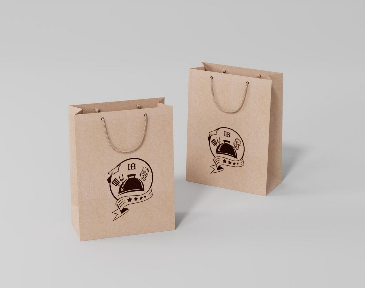

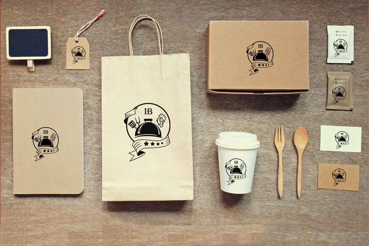

The Indian Biriyani’s logo, crafted by the skilled designers of Home to Globe, exemplifies their exceptional creativity and attention to detail. The logo brilliantly encapsulates the essence of “Indian Biryani” while incorporating the unique charm of Home to Globe’s signature design style.
The logo prominently features the “Indian Biryani” text set in the Algerian Mesa Regular font. Algerian Mesa Regular is a decorative typeface known for its ornate and stylish letterforms, making it an excellent choice for logos that seek to evoke a vintage or classic aesthetic. The letters are likely to have intricate details and elegant curves, enhancing the overall appearance of the logo.
The logo primarily employs a simple but effective color scheme. The background is likely to be #FFFF (white), which gives the logo a clean and timeless look. White is often associated with purity, elegance, and simplicity, which can resonate well with the idea of traditional and authentic Indian cuisine.
The text “Indian Biryani” is set in #0000 (black), creating a striking contrast against the white background. Black adds a sense of boldness, sophistication, and professionalism to the logo. The black color also enhances the readability of the text, ensuring that the restaurant’s name stands out clearly and leaves a lasting impression on viewers.
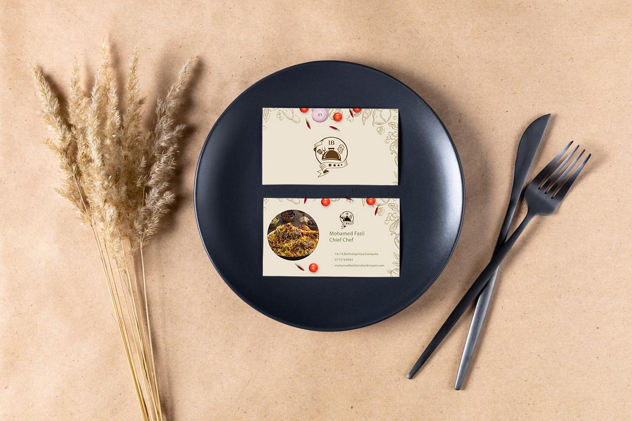
The front of the business card is likely to feature the “Indian Biryani” logo, with the text set in the Algerian Mesa Regular font. The logo, with its intricate and elegant design, occupies a prominent position on the front side of the card. The colors #0000 (black) and #FFFF (white) create a strong contrast, drawing attention to the logo and the restaurant’s name. The back of the business card may contain essential contact information and additional branding elements. The contact details, such as the restaurant’s address, phone number, website, and email address, are likely to be presented in a legible and professional font to ensure ease of communication. Overall, the business card for “Indian Biryani” is expected to reflect the elegance and sophistication of the restaurant’s brand identity. The use of the Algerian Mesa Regular font and the colors #0000 (black) and #FFFF (white) create a visually striking and memorable design that leaves a lasting impression on potential customers and business associates.
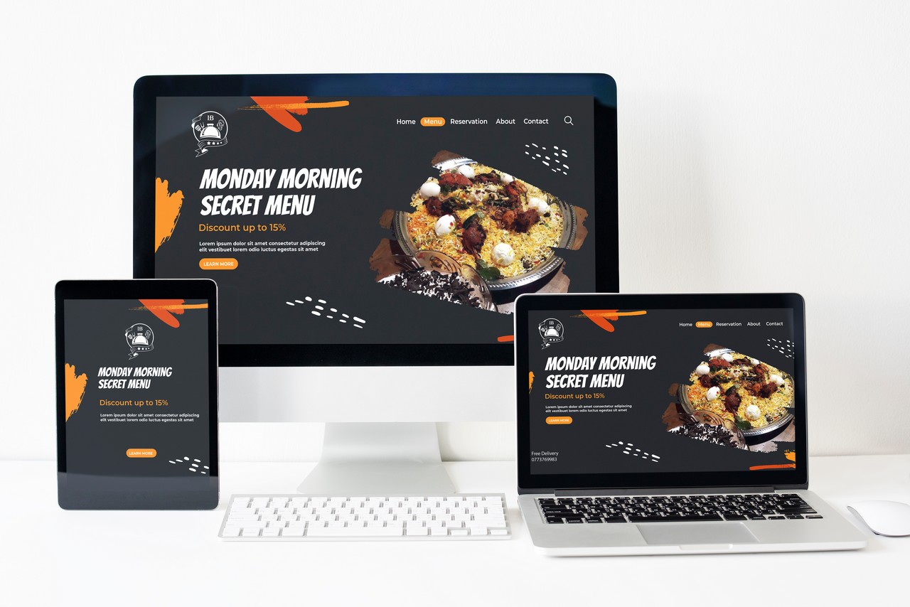
A fully responsive web application designed by “Home to Globe” would cater to users across various devices and screen sizes, ensuring a seamless and optimal user experience.
The web application would automatically adjust its layout and content to fit different screen sizes, from desktops and laptops to tablets and smartphones. This ensures that users can access and navigate the application easily, regardless of the device they are using. The application would feature a user-friendly interface with intuitive navigation, clear menus, and easily accessible features. The design would prioritize user experience, making it simple for users to interact with the application and accomplish their tasks efficiently. The web application would be compatible with various web browsers, including Chrome, Firefox, Safari, and Edge, to ensure that users can access it without any issues, regardless of their browser preferences.
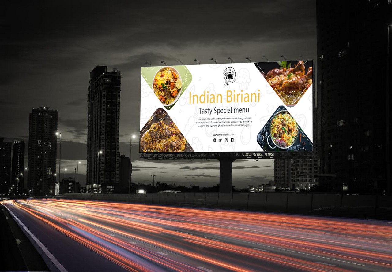
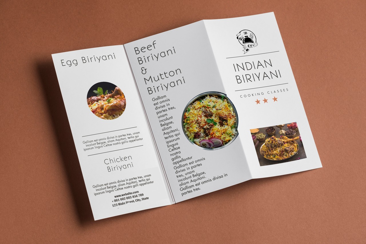
The banner design should capture the essence of “Indian Biryani,” showcasing the dish’s appetizing appearance and evoking a sense of culinary delight. The design should be visually striking, drawing attention to the restaurant and enticing potential customers to experience the flavors of the biryani. The banner might feature a warm and inviting background to represent the comforting nature of Indian cuisine. Earthy tones like saffron orange or deep maroon can be used to create a sense of warmth, while hints of gold or copper can add a touch of sophistication.
Main Visual Element: In the center of the banner, a captivating image of a beautifully presented plate of biryani could be the focal point. The biryani should be garnished with fresh herbs and aromatic spices, exuding a mouthwatering appeal. The steam rising from the dish adds an element of freshness and immediacy.
Typography: The restaurant’s name, “Indian Biryani,” could be displayed prominently on the banner, using a stylish font that complements the overall design. The choice of font should balance elegance with legibility, ensuring that the text is easy to read from a distance.
Additional Elements: To add visual interest, the banner design might incorporate traditional Indian design elements. Delicate paisley patterns, henna motifs, or subtle illustrations of spices could be used as decorative accents around the main image and text. These elements connect the banner to the cultural roots of Indian cuisine and reinforce the theme of the restaurant.