


The “White Wings” logo is an elegant and enchanting design that beautifully captures the essence of purity, love, and the soaring spirit of romance. The centerpiece of the logo features a pair of graceful and delicately curved white wings, symbolizing the journey of togetherness and new beginnings that weddings represent. The wings gently rise upwards, evoking a sense of upliftment and hope, further enhancing the romantic and dreamlike atmosphere. The brand name “White Wings” is tastefully integrated into the logo, using the classic and refined “Trajan Regular” font. This choice of font adds a touch of timelessness and sophistication to the overall design. The primary color palette of white and black ensures a captivating and visually appealing contrast, with white signifying purity and innocence, while black adds a sense of elegance and formality. The “White Wings” logo, with its graceful wings and exquisite typography, perfectly embodies the magical and enchanting ambiance of the wedding banquet hall, positioning it as the premier destination for couples seeking an unforgettable and truly exceptional wedding experience
The color palette used for the “White Wings” branding consists of primarily two colors
White (#FFFFFF) White is the dominant color in the branding, symbolizing purity, innocence, and new beginnings. It conveys a sense of elegance, sophistication, and simplicity, creating a pristine and ethereal atmosphere. As the primary color, it complements the wedding theme and evokes a sense of purity and joy that is often associated with weddings
Black (#000000) Black is used as an accent color in the branding. Its deep and contrasting nature enhances the overall design, adding a touch of formality, luxury, and timeless elegance. Black creates a sense of sophistication and complements the white, creating a visually striking and captivating contrast.
For the branding of White Wings, the fonts Colonna MT Std Regular and Galba MN were thoughtfully selected to convey an aura of elegance and sophistication. Here’s a small description of the font selection for the brand:
The font pairing of Colonna MT Std Regular and Galba MN was chosen to capture the essence of refined beauty and timeless grace that defines White Wings. Colonna MT Std Regular, with its classical and ornate letterforms, exudes a sense of grandeur and adds a touch of traditional elegance to the brand’s visual identity. Galba MN, on the other hand, offers a modern twist with its clean lines and contemporary style, creating a perfect balance between classic and contemporary aesthetics.
Together, these fonts create a harmonious typographic system that reflects the venue’s commitment to creating unforgettable and sophisticated experiences for special occasions.
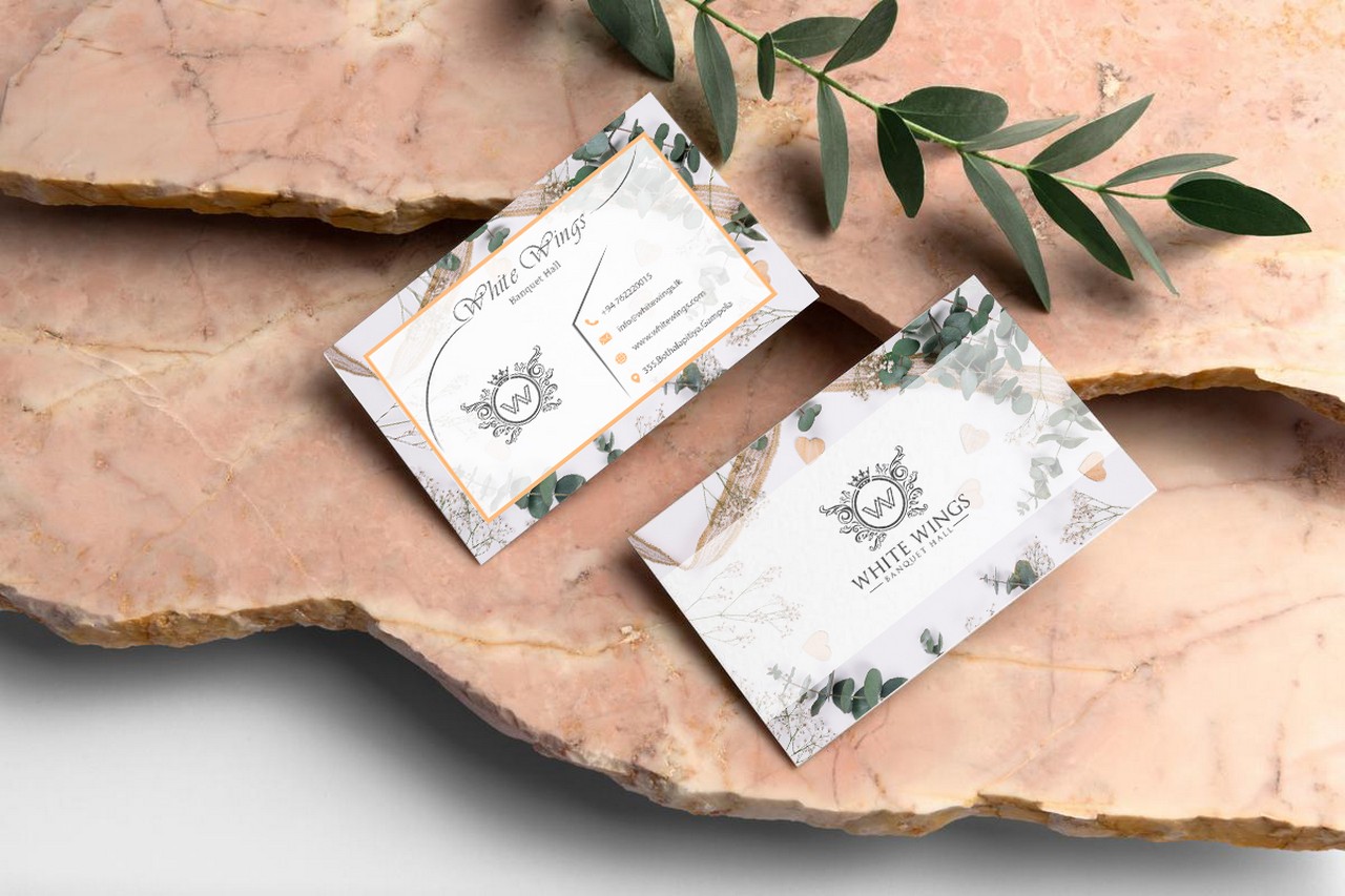
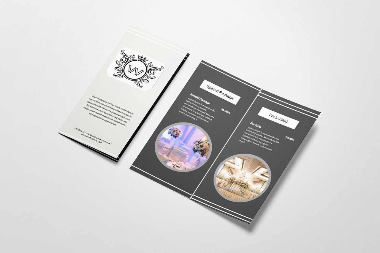
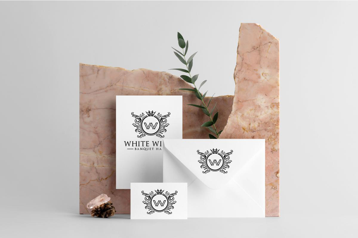
The business card features an exquisite design, reflecting the elegance and charm of the White Wings wedding banquet hall. The card’s pristine white background symbolizes purity and new beginnings, creating a sense of sophistication. The card showcases a graceful White Wings logo, with delicately curved wings, evoking the spirit of love and romance associated with weddings. The brand name “White Wings” is elegantly presented in the classic and refined “Trajan Regular” font, adding a touch of timeless elegance. The business card includes essential contact details, such as the venue’s address, phone number, email address, and website, ensuring easy access to vital information.
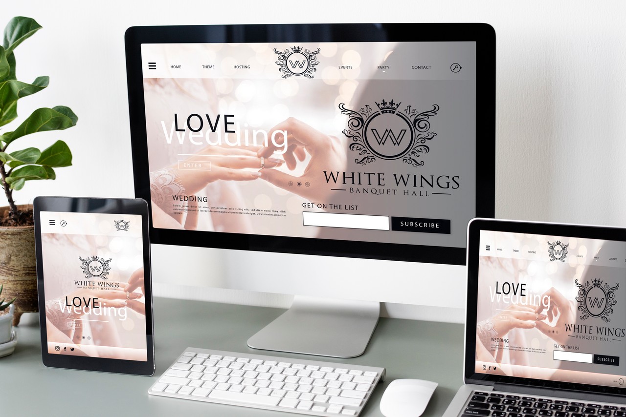
The web application for “White Wings” would serve a specific purpose related to the operations of the wedding banquet hall. It might include features for event management, online bookings, customer inquiries, gallery showcasing, and more
The web application designed by Home to globe with responsiveness in mind, ensuring that it works seamlessly on various devices and screen sizes, including desktops, laptops, tablets, and mobile phones. A user-friendly interface would be a priority, making it easy for visitors to navigate the application, find information, and perform desired actions effortlessly.
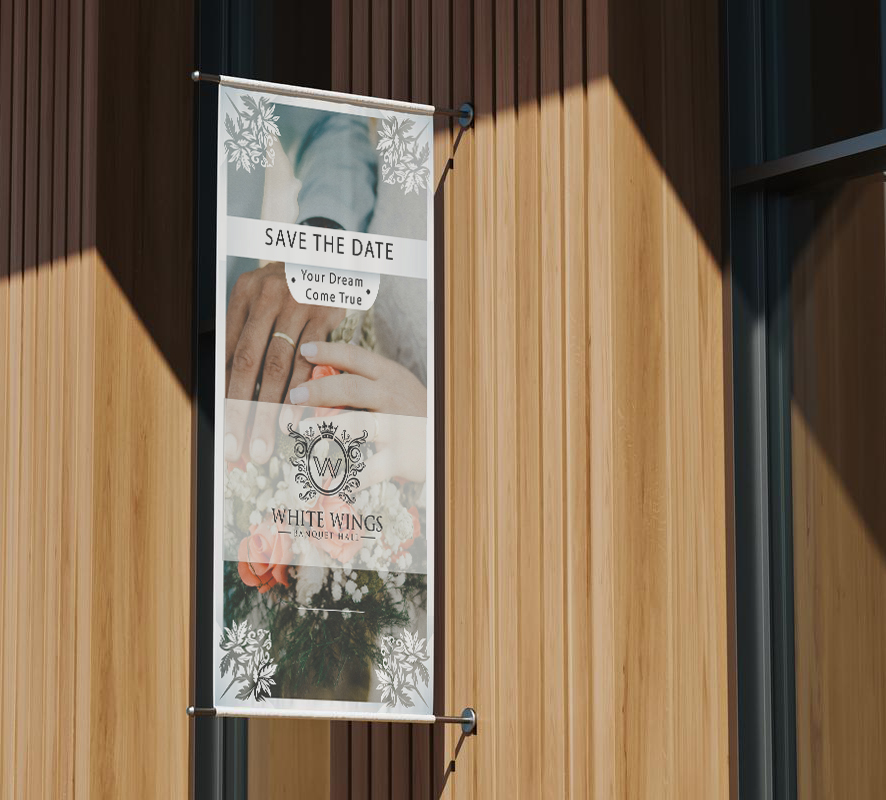
The banner designed by “Home to Globe” for “White Wing” exudes sophistication and elegance with its carefully chosen color palette and elegant typography. The banner’s design is a seamless blend of timeless simplicity and modern appeal, reflecting the high standards of the wedding banquet hall
Color Palette: The primary color palette for the banner is a striking combination of #FFFF (White) and #0000 (Black). The use of pure white (#FFFF) symbolizes purity, sophistication, and a sense of luxury, while the deep black (#0000) creates a high-contrast effect, adding an element of modernity and formality to the design.
Typography: The banner features the classic and refined “Trajan Regular” font, as specified above. The use of Trajan Regular enhances the banner’s elegance and timeless appeal, creating a strong and memorable visual impression. It complements the overall design, making the text stand out with a touch of regal elegance
Logo and Branding: The “White Wing” logo takes pride of place, positioned prominently in the banner’s design. Its presence reinforces brand identity and establishes “White Wing” as a trusted and distinguished wedding venue. The entire banner design aligns seamlessly with “White Wing’s” overall branding, maintaining a consistent and cohesive image.
Responsive Design: With a focus on delivering a seamless user experience, the banner is designed to be fully responsive. It adapts flawlessly to various screen sizes and devices, ensuring that its captivating design can be appreciated on desktops, laptops, tablets, and mobile phones.